Do you ever feel slightly let down by a book? Like maybe what you hoped it would be was just not completely realized? This is a feeling I recognize in myself more and more frequently. Maybe it's that I'm getting older (big birthday this year - keeping it in perspective). Or maybe it's just that I've reached the point where I've read so many knockout titles that when a book doesn't go deliver as much as it could, I feel a bit cheated.
I find this happening a lot now that I'm reading kidlit pretty much exclusively (with the exception of textbooks, of course). There are a ton of fantastic kid's books on the shelves in libraries and bookstores these days. Overall the quality really rivals anything I remember from my own childhood. That's especially true of multicultural kidlit, where phenomenal authors like Rita Williams Garcia and Grace Lin and Christopher Paul Curtis and Pam Munoz Ryan turn out consistently top-notch books where diversity is interwoven seamlessly into the storyline. And so when I find a book that just doesn't go quite far enough, I feel a little like it's been a wasted opportunity.
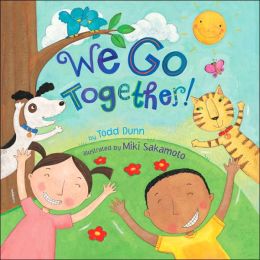
I found this to be the case with one book in particular lately. I really hesitated writing about this book, because I wanted to like it, but just couldn't 100% embrace it, and I couldn't figure out why. The book in question is We Go Together by Todd Dunn, illustrated by Miki Sakamoto. Sprout nabbed this one on a recent library visit and I suspect that's mostly because of the cover - bright sunshine, animals and birds, a white-skinned girl and brown-skinned boy with huge smiles. What's not to like?
The text and illustrations are perfectly suited, as Sakamoto's cheerful figures and palette match Dunn's bounce rhymes very well. There's no real narrative here, just a depiction of things that go very well together - like moon and night, for instance, or string and kite. Each spread has a sly joke or whimsical touch that works quite nicely. Sometimes there's a double meaning included, like "We go together like elephant and trunk", which shows a chipper purple elephant bearing a small chest on his back. Cute, in all, and upbeat, which always makes for a nice addition to any reading session.
So what was it that bothered me? It took a while to figure out, but I finally narrowed it down to the last spread. Throughout the book we have a reasonable attempt to depict diversity - most of the spreads with more than one human character has multiple ethnicities represented. But on the last page, the text reads: "We go together, that's what we do. We go together because you love me and I love you!". Sweet, but here's where the missed opportunity comes in for me: the mother and daughter depicted on the page look almost exactly identical: white skin, rosy cheeks, brown hair turned up at the ends.
For me this is a misstep - the whole book is about things that go together, so why not use this spread as a chance to emphasize that things don't have to look alike to go together? This would have been a great opportunity to depict a transracial family, or at the very least two people who looked dissimilar. Maybe mom could have red curly hair and be hugging a boy with straight black hair? Would that be too much to ask? Couldn't the creators of the book have used this as a way to drive home the point to kids that belonging isn't about looking just exactly the same, but rather belonging has to do with the feelings mentioned in the page text?
Don't get me wrong, I have nothing against this particular book, and it's not one that I would prevent Sprout from reading. It's cute enough, the illustrations are well-done, and it's something the author and illustrator should be very proud of creating. I also don't think that every single kids' book should cater to transracial families -- because come on, where's the reality in that? But I couldn't help but wonder how much stronger this little slice of kidlit could have been with just a tweak in the approach.
And here's where the missed opportunity comes in: because changing our environment and embracing more diversity is as simple as the decision to show the world families don't all have to match. The message of the title could have been that much more impactful, for my mind, with just a shift in this one editorial choice. These are the kinds of things that don't escape my notice, now that I'm parenting transracially. And you can be sure that if I'm noticing it, Sprout and all the other kids his age aren't letting these messages, however slight, pass them by. This kind of small choice strengthens the argument for kids on the playground who ask us questions like, "Are you his mom? Why don't you look like him?"
Listen, there are a host of reasons that parents and kids don't resemble one another, and adoption certainly isn't the only one. So let's be brave, kidlit creators: let's teach our kids that matching is more than just having the same hair color or wearing the same outfit. Let's throw them a curve and show them a daddy in a wheelchair or a mama and baby with different skin tones. Let's trust that kids can handle the challenge of seeing a parent and child for what they are, even when they don't look the same. Because that's an opportunity -- for thought, discussion, inclusion -- that no one should miss.


1 comment:
YES! A missed opportunity for a book to go from ok to great bugs me more than a really bad book that no amount of changes can save! Good call and kudos to you for figuring out the missing item!
Post a Comment